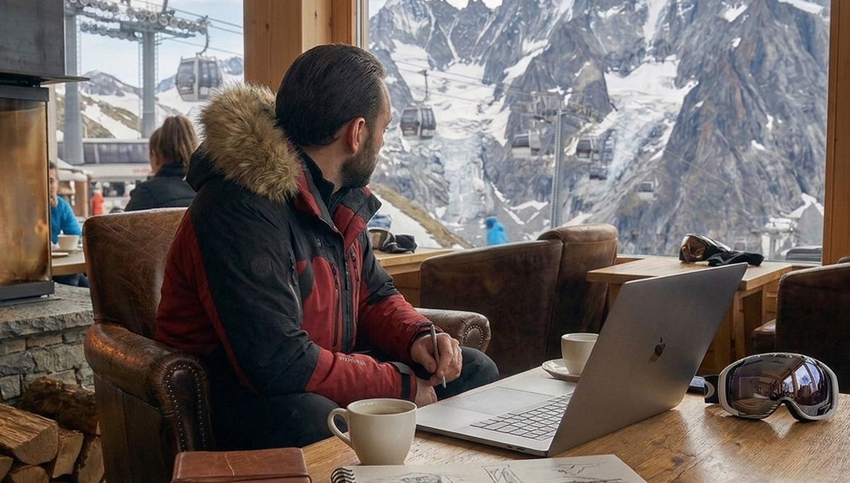
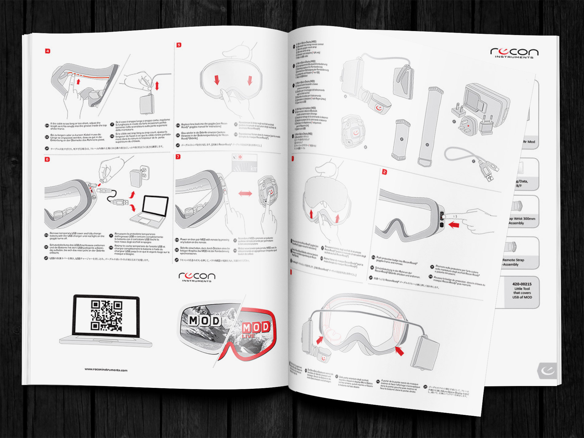
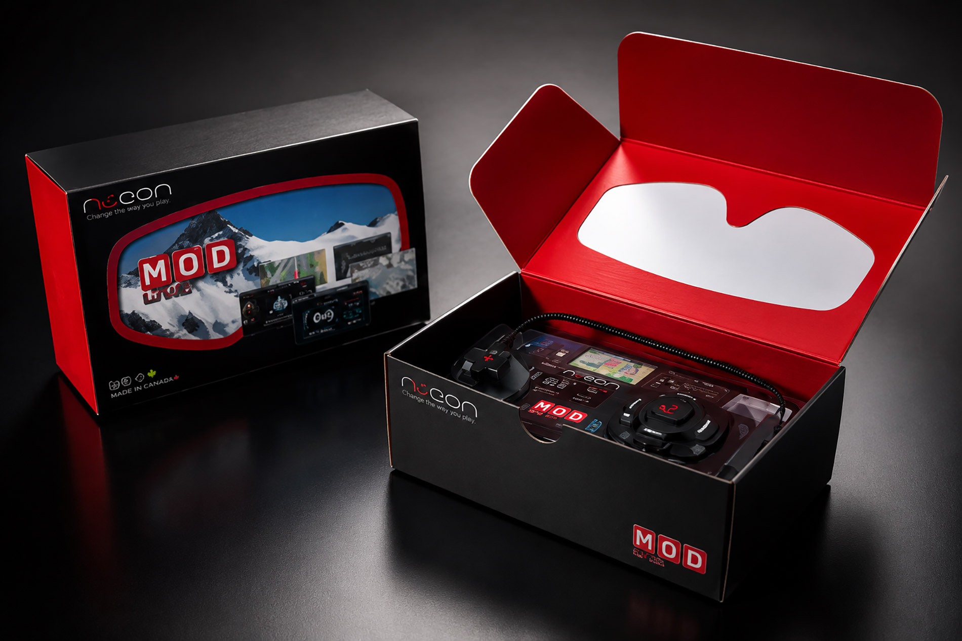
Recon Instruments
Graphic design, illustrations, packaging
Crafting a visual language for a a Canadian technology company that produced wearable “heads-up displays” for sports.
Project Overview
I was brought on to bridge the gap between high-level wearable engineering and consumer-facing retail. For the 2012-2013 launch of the MOD Live, I was tasked with crafting a comprehensive physical and digital identity that established Recon Instruments as a premium leader in the nascent heads-up display (HUD) market.
Research & Planning
The challenge was to translate the “Magic of the HUD”—the visceral experience of seeing data in motion 0 into a tangible retail environment. Consumers were wary of “niche gadgets,” and the brand needed to transition from a technical novelty to a must-have piece of high-performance gear for alpine and endurance athletes.
Product Packaging
I designed and localized a comprehensive suite of packaging and instructional collateral for the MOD Live unit, ensuring the premium, high-performance identity remained consistent even when the hardware was sold as an individual modular component separate from the goggles.
My Methods
My scope was total: from the high-fidelity packaging design and instructional booklets that greeted users upon unboxing, to the modular web ecosystem that streamlined the global purchasing journey. I built a rigid design system to ensure that these varied touchpoints - both print and digital - remained unified during a period of rapid product scaling.
The Result
A cohesive, high-performance retail experience that successfully moved the product beyond the gadget enthusiast crowd. By standardizing the visual language across packaging, collateral, and the web, I helped define the brand architecture for their most pivotal season of global growth, turning complex technical hardware into a premium, aspirational lifestyle product.
Typography, Colors, and Patterns


